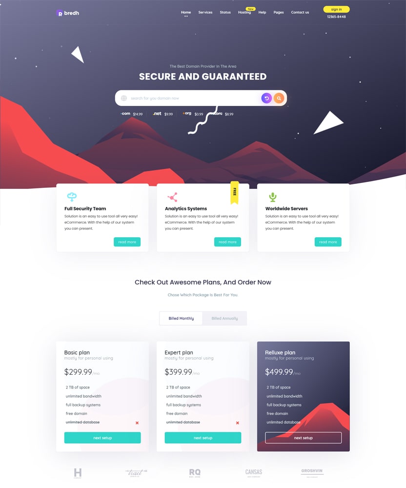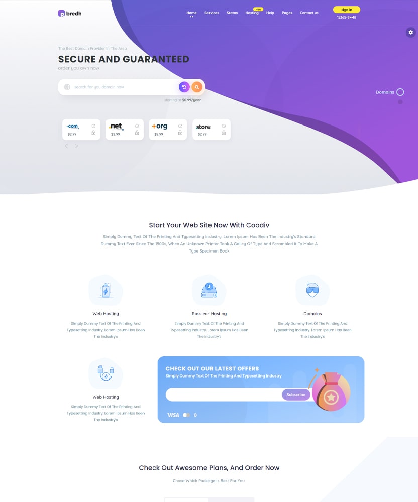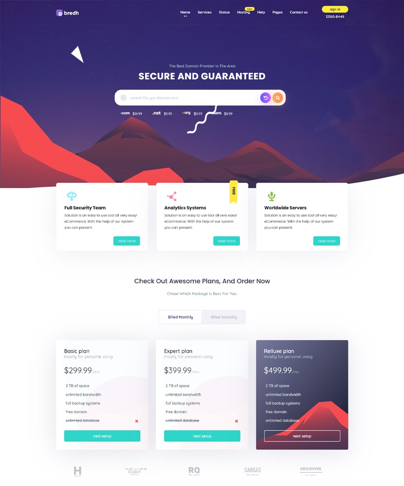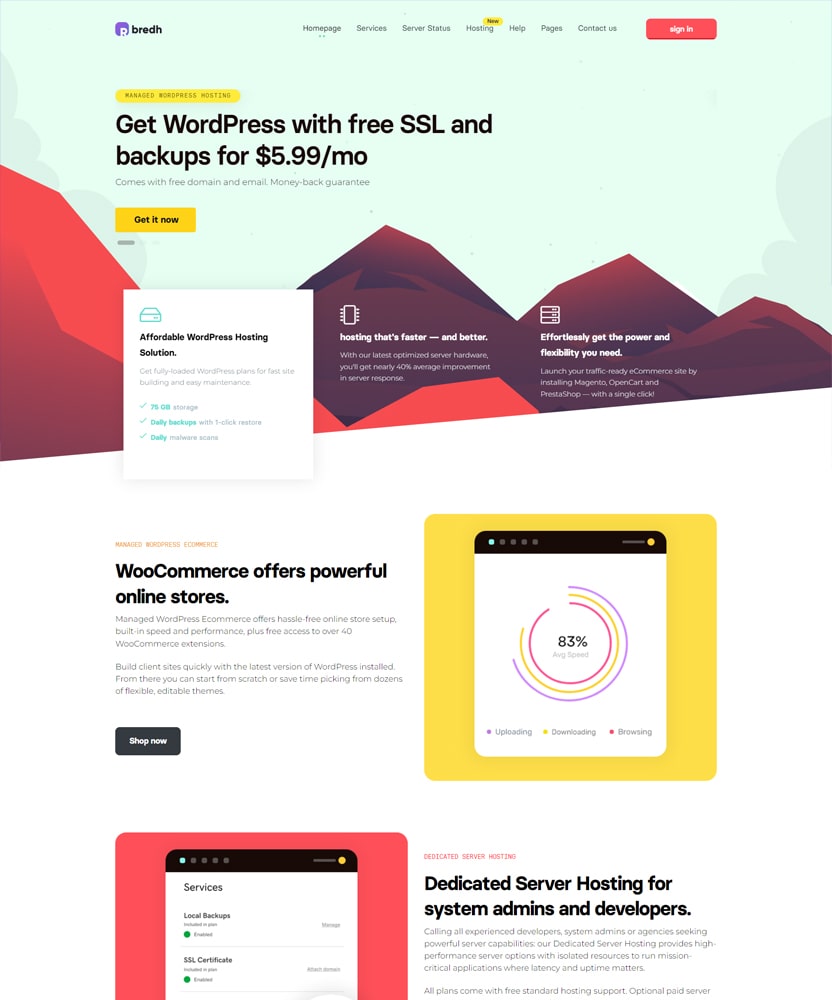
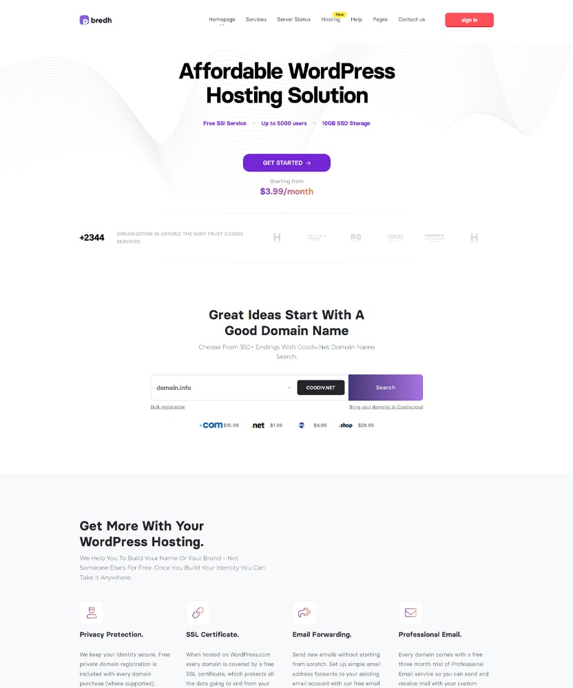
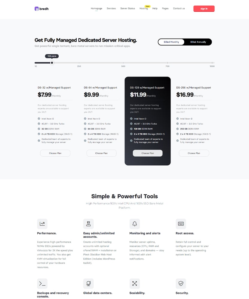
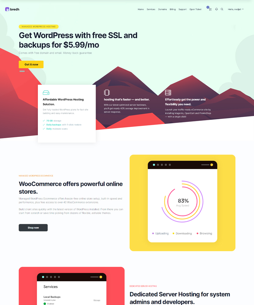
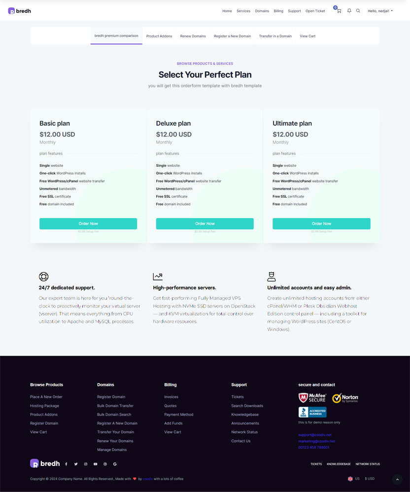
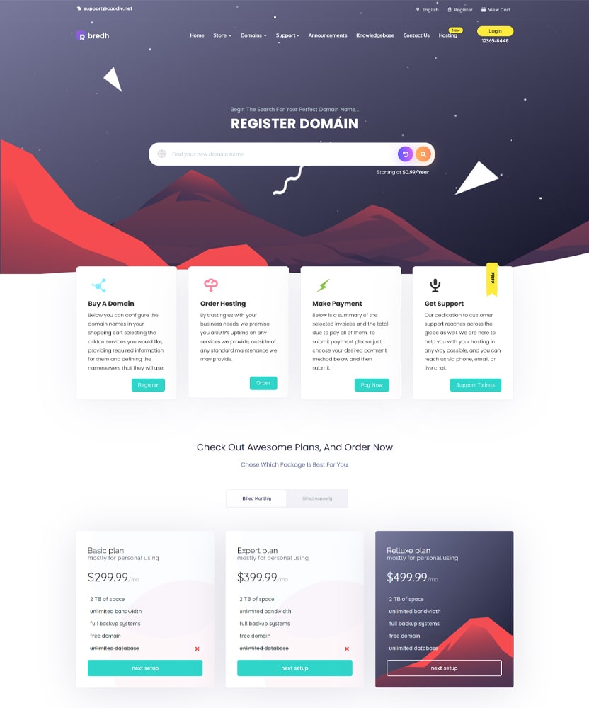
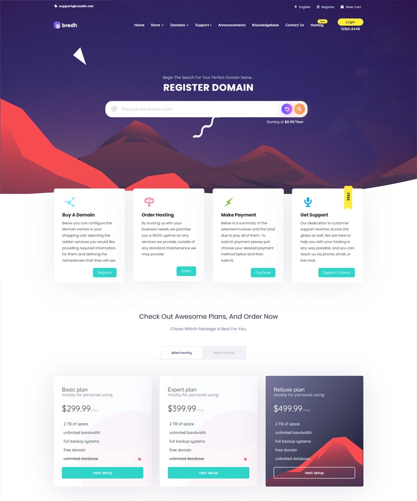
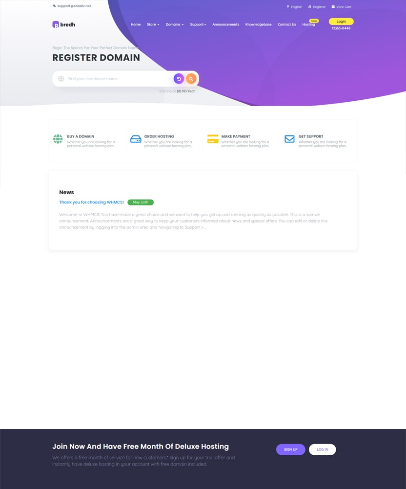
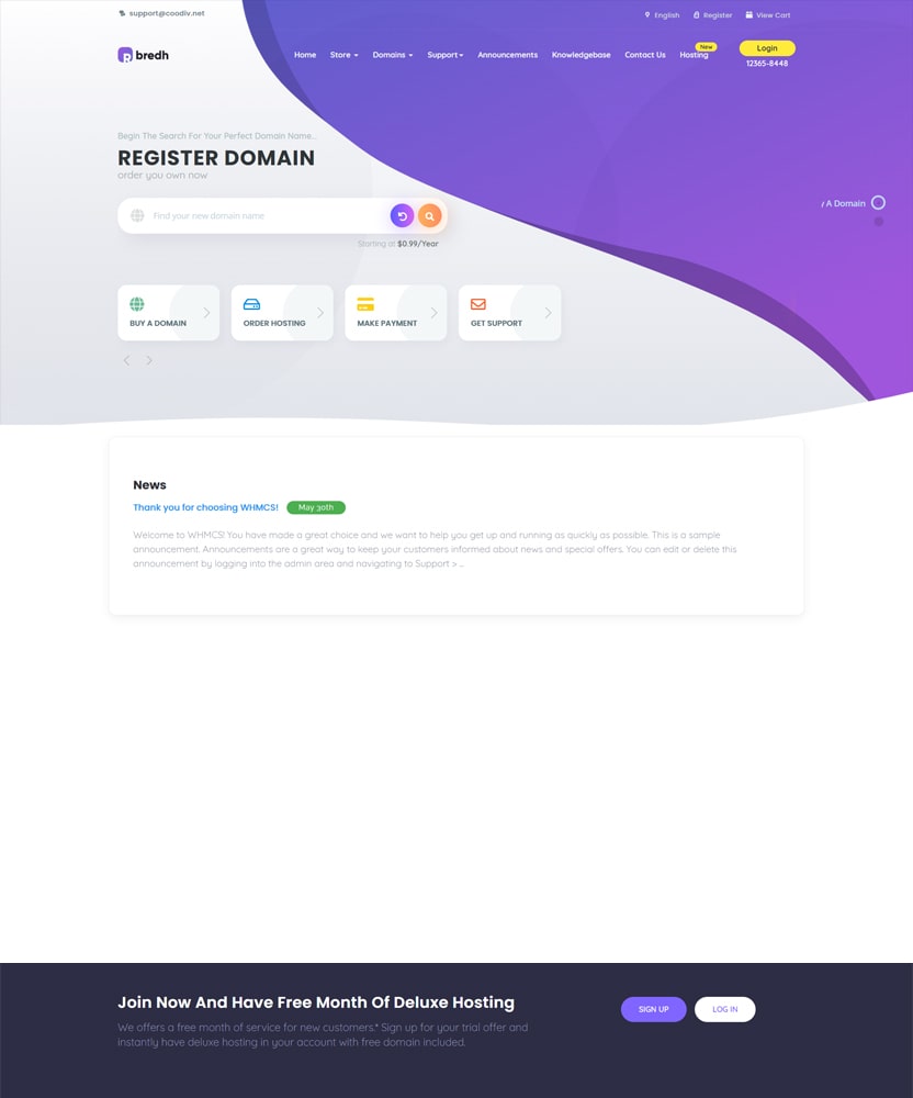
Responsive Design.
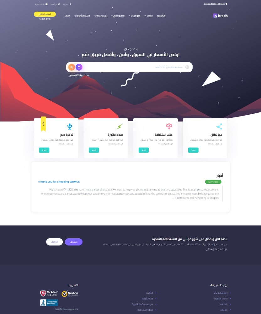
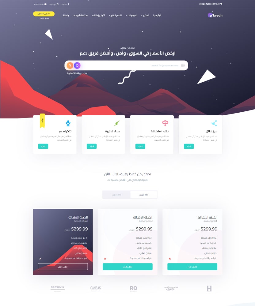
bredh is fully responsive and mobile friendly design.
The perfect Solution to build your hosting Business, Domains business website, WordPress hosting and more.

bredh is fully responsive and mobile friendly design.
Every code is super organized, readable, & well commented.
All products are well documented for better understand.
100% validated with W3C. So no Errors are caused by backward.
bredh uses free Google fonts to make it easier to use.
Every code is super organized, readable, & customizable.
Receive free & regular comprehensive updates for life..
Created with usability, functional and performance in mind..
We provide the obligate inner pages that are suitable for all of your Business such as hosting Business, Domains business websites, WordPress hosting, and much more.
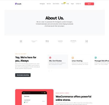
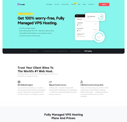
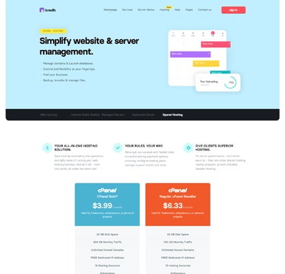
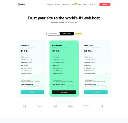
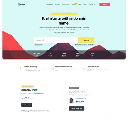
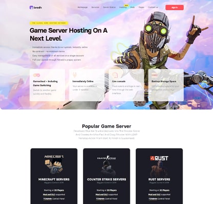
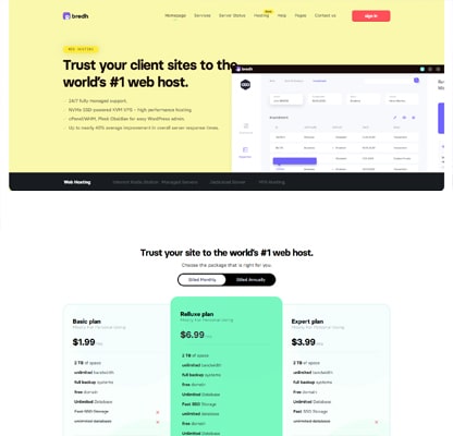
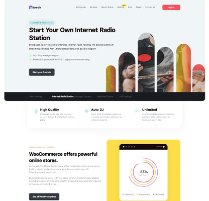
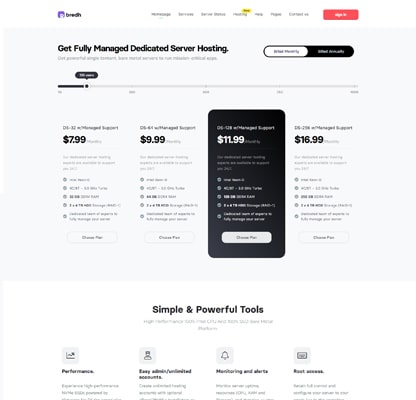
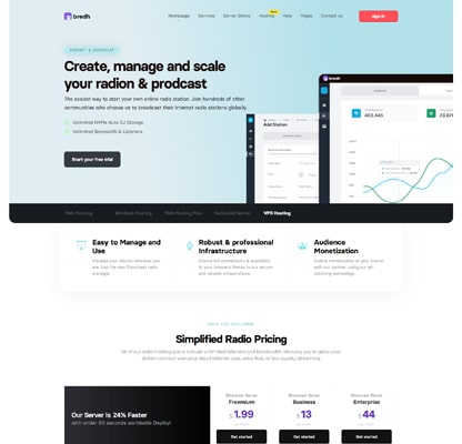
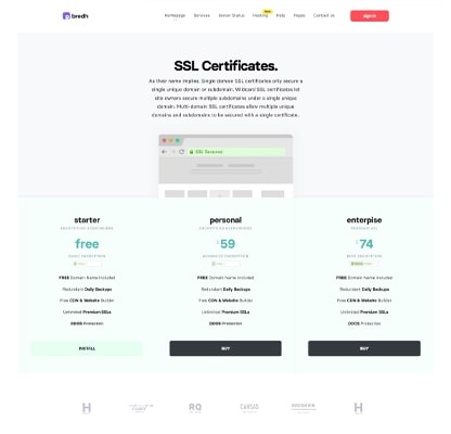
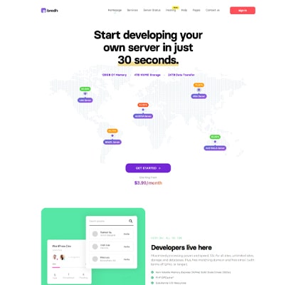
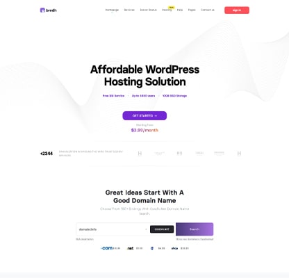
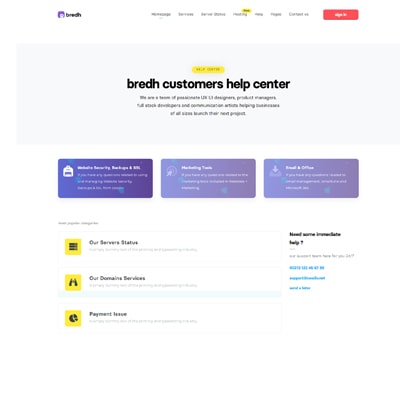
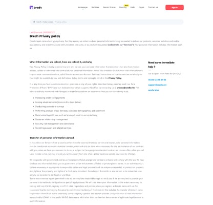
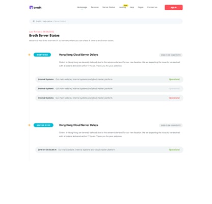
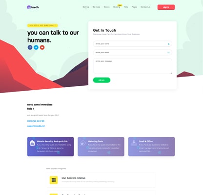
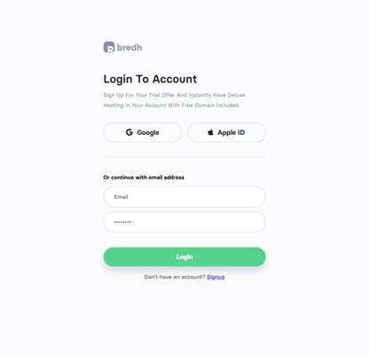
You can use bredh 1.7 elements and blocks also in your project to build your own unique website.
© 2024 Coodiv All Rights Reserved.